ShopDreamUp AI ArtDreamUp
Deviation Actions


Suggested Deviants


![[COMMISSION] Aldred - Wolven Valor Bard](https://images-wixmp-ed30a86b8c4ca887773594c2.wixmp.com/f/6c7f6b9c-29b4-460e-9c7e-f4d74ded9cb9/dcm0wbi-4c2d8020-bbff-41bb-9fd6-2894ab40241f.jpg/v1/crop/w_184,h_184,x_0,y_17,scl_0.28006088280061,q_70,strp/_commission__aldred___wolven_valor_bard_by_s0ulafein_dcm0wbi-92s-2x.jpg?token=eyJ0eXAiOiJKV1QiLCJhbGciOiJIUzI1NiJ9.eyJzdWIiOiJ1cm46YXBwOjdlMGQxODg5ODIyNjQzNzNhNWYwZDQxNWVhMGQyNmUwIiwiaXNzIjoidXJuOmFwcDo3ZTBkMTg4OTgyMjY0MzczYTVmMGQ0MTVlYTBkMjZlMCIsIm9iaiI6W1t7ImhlaWdodCI6Ijw9OTAwIiwicGF0aCI6IlwvZlwvNmM3ZjZiOWMtMjliNC00NjBlLTljN2UtZjRkNzRkZWQ5Y2I5XC9kY20wd2JpLTRjMmQ4MDIwLWJiZmYtNDFiYi05ZmQ2LTI4OTRhYjQwMjQxZi5qcGciLCJ3aWR0aCI6Ijw9NjU3In1dXSwiYXVkIjpbInVybjpzZXJ2aWNlOmltYWdlLm9wZXJhdGlvbnMiXX0.EMEzBavEuRSWjd1sKk9vxM7AfhPOED7ONUCjEeXKmag)
![[COMMISSION] Aldred - Wolven Valor Bard](https://images-wixmp-ed30a86b8c4ca887773594c2.wixmp.com/f/6c7f6b9c-29b4-460e-9c7e-f4d74ded9cb9/dcm0wbi-4c2d8020-bbff-41bb-9fd6-2894ab40241f.jpg/v1/crop/w_92,h_92,x_0,y_9,scl_0.1400304414003,q_70,strp/_commission__aldred___wolven_valor_bard_by_s0ulafein_dcm0wbi-92s.jpg?token=eyJ0eXAiOiJKV1QiLCJhbGciOiJIUzI1NiJ9.eyJzdWIiOiJ1cm46YXBwOjdlMGQxODg5ODIyNjQzNzNhNWYwZDQxNWVhMGQyNmUwIiwiaXNzIjoidXJuOmFwcDo3ZTBkMTg4OTgyMjY0MzczYTVmMGQ0MTVlYTBkMjZlMCIsIm9iaiI6W1t7ImhlaWdodCI6Ijw9OTAwIiwicGF0aCI6IlwvZlwvNmM3ZjZiOWMtMjliNC00NjBlLTljN2UtZjRkNzRkZWQ5Y2I5XC9kY20wd2JpLTRjMmQ4MDIwLWJiZmYtNDFiYi05ZmQ2LTI4OTRhYjQwMjQxZi5qcGciLCJ3aWR0aCI6Ijw9NjU3In1dXSwiYXVkIjpbInVybjpzZXJ2aWNlOmltYWdlLm9wZXJhdGlvbnMiXX0.EMEzBavEuRSWjd1sKk9vxM7AfhPOED7ONUCjEeXKmag)


Suggested Collections


You Might Like…


Description
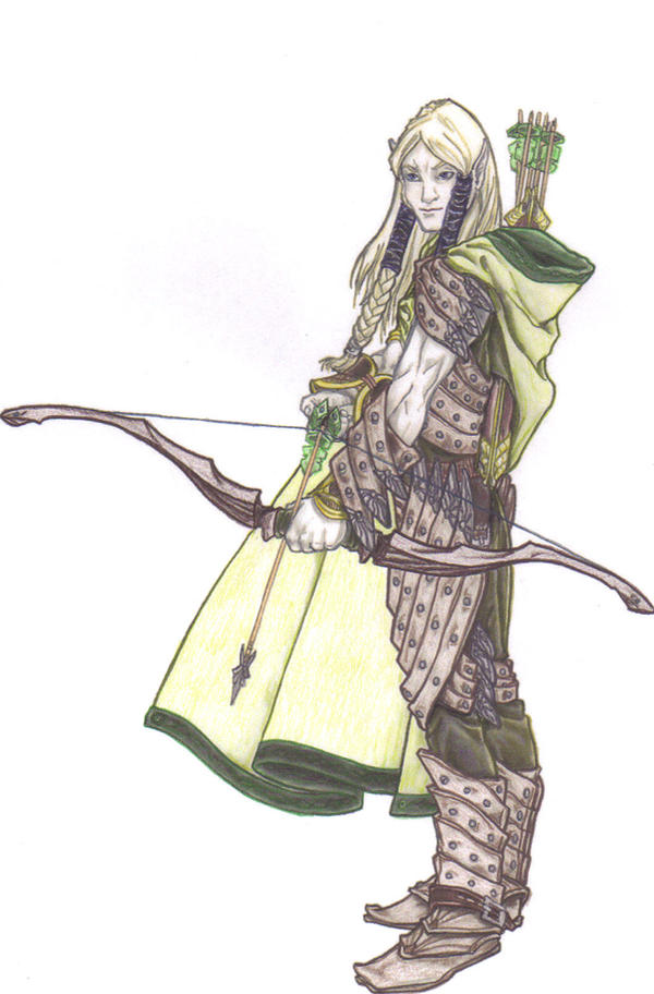
This is a piece done by Hugo Solis [link] for Jason Beardsley [link] on the Paizo Boards.
Colours are by me. [Done using Derwent Studio colour pencils]
I knocked this one over quicker than most. Hopefully that's a good sign that I'm becoming more confident .
Side Note: There was almost a calamity when I coloured his face. I accidently picked up the Yellow I was using for his hair instead of the Flesh and I actually coloured his face Yellow before I realized. Thankfully the eraser got the worst of it (which is good because it's usually hard to use an eraser without affecting more of the piece).
So if anyone notices a slight Yellowish tinge to his face there's your answer... it wasn't intentional!
Image size
1058x1607px 270.25 KB
© 2009 - 2024 flash-cxxi
Comments13
Join the community to add your comment. Already a deviant? Log In
Sometimes layering up colors very lightly in colored pencils gives a luminous quality to the final piece. You should try it sometime.  (Smile)")